
Whimsical photoshoots, especially surreal composites and digital paintings, are some of our favorite styles of dog portraits to create. Which is why we were so excited to have an opportunity to work on this private Chihuahua portrait commission recently. As these projects tend to be rather open ended and a little less straight forward to commission in comparison to our standard photo shoots, we thought it might be fun to walk through each step.
Surreal pet portraits move beyond possible
One of our favorite thing about these creative pet portrait commissions is that we’re not confined by the limitations of what is real or possible to capture in camera. Due to the free form nature of these pieces, we often find our most creative compositions happen when we are the least constrained by client specifications and requests. This commission was a great example of our exploratory workflow and client expectations blending into a beautiful and original art piece.

Pet art portraits are inspired, not designed
It’s not every day that most dog lovers commission a portrait of their pet. Many clients come to us unsure about how to even begin the commission process. They often know they want something original and they may even have a general idea of what, but expressing those ideas and knowing what to ask for can be difficult. Which is why we strongly encourage clients to contact the studio prior to scheduling a session for their pet.
During these introductory calls we try to explore why a client is commissioning the piece, what key themes or subjects we should touch on or emphasize while working, what size the client expects to print, and realistically what kind of budget we are working within. We realize that no one likes talking budget, especially before seeing the final image – that’s why we never make clients commit to print orders until after their images are proofed. But it’s better to go into a composite commission with an honest ballpark of how much you might want to spend on pet portraits, than to get half way through production only to realize that you don’t have the resources needed to print your fabulous art piece.
Composite pieces are limited primarily by time and asset availability
While no two digital paintings or photo composite commissions are the same, they all follow a few basic guidelines…
Finding great assets takes time (and sometimes costs money)
Like many established photographers, our studio has compiled a large library of photo assets, textures, and plates to work from. That said, it is simply impossible for us to photograph everything and anything that a client may wish to include in a composite. That means we either need to go out and capture the asset or acquire it through other means, usually either by purchasing a license from a stock photo library or by downloading the assets from rights free depositories, such as the Library of Congress. Depending on the complexity of the project and the rarity, state or specific requirements of the assets we are seeking, researching assets may take anywhere from 2 – 5 hours.
Asset research often inspires in unexpected ways
While the availability of specific assets can often be seen as a project limitation, the process of searching for assets can be tremendously helpful in itself. Asset research almost always sparks creative avenues we simply would never have thought of on our own. These sparks of creativity might be something as simple as the inclusion of the zeppelin and biplanes seen in this composition.

Occasionally, we will stumble on seemingly small asset during research that may influence the composition in broader ways. Such as the inclusion of Teddy Roosevelt on the back of the Chihuahua in this comp, which helped dictate which final image we inevitably decided to run with.

Larger prints require more detail
As a rule, we find that great portrait compositions should work from three relative distances. Your piece should hold up when inspected closely, be engaging when viewed at a minimum distance to be seen in its entirety, and interesting enough when viewed from afar to encourage viewers to come closer for further inspections. In other words, the image should feel interesting whether you’re forced to squint at a distance, holding it under a magnifying glass, and every distance in between. With smaller print sizes, this often means an effective viewing distance of 6″ to 6′. For larger prints, the effective viewing distance may be 6″ to 60′.
To cover such a wide range effectively an extremely detail oriented macro to micro approach to the composition. The full resolution file of this image is over 10,000 pixels in length and is sized to print at 24″ x 36″ in full 300 DPI resolution. Needless to say, it will look great printed in a large format and when viewed from across the room. But the print will also hold up to closer inspection, as the people seated at the literal foot of the dog were each individually cut out and trimmed – lending an absurd scale to the composition as a whole.
More complicated pieces take more time
While Photoshop has certainly made editing photos easier and quicker in recent years, compositing remains a relatively time intensive process. Spending a dozen hours on a project is a far cry from the hundreds of hours required to produce similar work in the past, but it’s still a dozen hours. And the fact remains, there is only so much that we can achieve in that timeframe. It’s a fairly simple equation. The more time we have to work with, the more detailed we can be.
Revision requests are welcome – and billed hourly
Commissions are in many ways a collaboration. We’re not simply making a piece for a client, with every commission we are attempting to impart a piece of our client in our work. At the end of the day that’s why clients commission us to produce custom work for them. If they wanted something that we produced in a vacuum they would have simply ordered one of our fine art prints already – as it would have been substantially easier and cheaper than commissioning a custom pet portrait. With that in mind, we are happy to start a project producing rough conceptual mockups and to modify “final” compositions to include feedback and edit requests to get your piece “just right”. We’ll never bill a block of hours without prior approval from a client, but there’s nothing stopping clients from requesting additional blocks of editing or compositing hours.
Step-by-Step breakdown of our latest surreal pet portrait commission
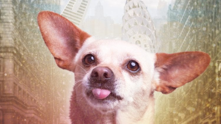
Our client approached us initially seeking a multi photo composite digital painting of their beloved Chihuahua. The couple had seen our composite portrait “Heads, they watch” and wanted something similar for their own pet, but a tad bit more colorful and upbeat, preferable featuring sights from New York City – a city the three had recently moved from.
Round 1: Initial Concept (8 hour block)

Our initial concept hit on many of the themes we discussed initially and fit the bill stylistically. While the client enjoyed the composition as a whole (they ended up also purchasing a print of the initial concept as well), upon thinking it over, they realized that they wanted to include landmarks from two other cities — Boston, which they had lived in previously, and Baltimore, their current home. Upon seeing the image, they also realized that they would prefer a full body image of their pet and would likely order a 24″ x 36″ print. Through a short exchange of emails we were able to realize a few landmarks that would make a fitting inclusion.
For Baltimore – the Dominos Sugar Factory sign, the Bromo Seltzer Clock Tower and the Washington Monument in Mount Vernon.
For Boston – the Citgo sign overlooking Fenway Park, the Prudential building, Make Way for Ducklings statues, and the Old South Meeting House.
Round 2: Final Concept (12 hour block)
Having received feedback on our prior color template and overall aesthetic, we knew we were heading in the right direction. But due to the addition of new assets, the shift to a full body pose for the dog and now with a target print size in hand, we realized pretty quickly that we would be unable to simply tweak our initial concept (not easily at least). Instead, we had little choice but to straight production essentially from scratch — reintroducing assets and themes that we liked in a new and more purposeful way.
Step 1: Image selection
We knew we had to include an image featuring the full body of the dog (which we had plenty of from our session), but which one? We inevitably settled on the image below. The photo checked a lot of boxes for us. It featured a full body pose of the dog, a clear view of the dog’s face, allowed for the dog to interact with ground assets in an interesting way, and allowed us to include another asset that we discovered during our second round of asset research that we will discuss in later steps. The image immediately below is representative of the unprocessed RAW file. It’s crisp, clean and got more right in camera than not — a solid base layer and foundational image to begin working from.

Step 2: RAW edits
Shooting in a RAW format, such as .CR2, is always a good idea as RAW files capture all data coming off of a camera’s sensor. But this format is not optimized for viewing or storage. As such these files are often tweaked (at least moderately) to correct for lens distortion, and optimize global color balance, luminosity and contrast before being exported to Photoshop. As you can see in comparison between this image and the last, there wasn’t much to correct in the photo as our lighting set up in the studio was fairly on point for this shoot.

Step 3: Background removal
When compositing we find it helps to start with squeaky clean assets. There are a few ways to go about prepping foundational assets, but we find the quickest and most reliable route is to simply path and clip elements that are likely to remain above the horizon line, as it is extremely likely whatever we place in the scene behind the dog at this point will likely be much further from the subject.

Step 4: Background replacement
Now that we’ve removed our background we’re simply going to replace it with something a bit cleaner. Note, this image and those that follow will be layered objects. While it may appear that this is a single rasterized layer, the dog and its transparent background are simply resting on top of the opaque lavender layer.

Step 5: Foreground crowds
This screenshot demonstrates well how we went about layering in the crowd seen at the dogs feet. Notice that this singular thin crowd already features several assets from disparate sources. In a more photo realistic project, would try to find crowd that would align with the dog in both perspective and focus. But as in this composition we are looking to achieve more dreamlike imagery, we’re happy to include crowds of varying and inconsistent sizes.

Step 6: Even more crowds
This step is one where you can really few our sense of urgency in our workflow. In all honesty, we could have spent 12 hours simply working on this section – clipping edges and seamlessly blending crowd into each other. But as time was a factor, a compromise was made – focusing on solely the more blatant elements that needed to be blended manually. Notice the rough overlap over the pup. In this step we’re not worried about depth of field, in so much as blending each panel together.

Step 7: A second dog layer
To ensure complete coverage, rather than cutting away the under crowd layer we’re adding a second dog layer over the crowd. By manually brushing away sections of the dog’s legs, feet and ankles that should be covered by the crowds we’re able to smoothly introduce a bit of depth to the image.

Step 8: Dubai for background flavor
We found this image of Dubai while attempting to research Boston assets to use in the image. While not especially on theme, we thought the imagery was unique enough to include here – almost reminiscent of the Emerald City in the Wizard of Oz. Does including Dubai make a lick of sense? Absolutely not. But this is a great example of why we love surreal digital paintings. We’re not merging Baltimore, Boston and New York in our composition – we’re creating a brand new imaginary place from the pieces. And at the end of the day, the suggested themes, visual lines, and overarching narrative are far more important than what is actually seen in the frame.

Step 9: Dominos Sugar and Citgo signs
If you’ve ever watched the Baltimore Orioles play the Sox’s at Fenway, you probably noticed that’s not where the Citgo sign goes. But again, where the Citgo sign exists in reality is not as important here as making sure that it feels like it belongs in the new world that we are creating. Remember, we’re not building an Almanac or Atlas – this is a dreamscape. And, when it comes to dreams – if it fits, it fits!

Step 10: Add the sky
A few clouds and a nice clear blue sky placed over a subtle touch of brightness. That short round gradient of bright light peaking over the tallest tower won’t be very visible in our final image, but it does help set the tone for our final image and where our skylines should be placed.

Step 11: Mirror the sky
In this step we are duplicating the sky and inverting it as a mirrored image. We’re careful to blend the overlapping layer, so that we have a nice smooth gradient between the two skies. We then added a subtle ripple pattern to the bottom sky to help mimic the effect of a lake or reflecting pool. Our goal with this layer is simply to keep the viewer guessing. The patterning is familiar, it resembles a body of water at a glance, but reflection of the Dubai skyline doesn’t match. The break isn’t glaring enough to be obvious, but hopefully just wrong enough to keep the viewer subconsciously on their toes.

Step 12: A drop of brilliance
Remember the subtle background gradient we added to our under layer previously? We’re expanding on it here, but in a more noticeable way. Through careful use of the Screen layer blend mode we are able to mimic specular highlights through the sky as well as a touch of atmospheric perspective – lending a pinch of depth to the upper part of the frame.

Step 13: Teddy Motherlickin’ Roosevelt riding a dog
I’ll be honest, this wasn’t a planned addition. But when you have the opportunity to include the 26th President of the United States and a literal Rough Rider to a composition, you take it. I mean, seriously. How do you stumble on that photo and not find a way to use it? Moving on…

Step 14: Boston and Baltimore make an appearance
As the client requested, we made sure to include the following landmarks; (from left to right) the Old South Meeting House, Prudential building, Chrysler Building, the Bromo Seltzer Tower (with the original Bromo bottle), and the Mount Washington Monument from Mount Vernon square in Baltimore. The buildings are arranged subtly with the shape of a dog’s paw.

Step 15: Make Way for Ducklings
We really weren’t sure how we were going to include these statues. They’re not large and it didn’t seem like there was much room for them. Then we realized that the curve of the duckling’s paths were actually not that far off from the curve of the dogs hindquarters and tail.

Step 16: Duckling Shadows
While we haven’t been super careful about shadows for most of this composite, the ducks needed a little extra help to look like they belonged there. Just because you’re forcing an asset into the frame doesn’t mean it has to look like it was just slapped on there. So, we went through and manually brushed in little shadows below each duck, tying them in ever so slightly with their surroundings.

Step 17: Biplanes and a dirigible
Like ol’ Teddy, the aircraft in the image were another minor flourish that we added unprompted. Being relatively small in scale, adding the blimp and dog fighting planes didn’t take much time. And, by changing the transparency and size of the planes it was a quick way to add both depth and scale to the image.

Step 18: Environmental effects
When combining a lot of assets from disparate sources, it can be tricky thing making them all blend effectively. We find one of the simplest ways to bring assets together is to introduce shared light sources and directional shadows. This technique offers the added bonus of providing new opportunities to increase contrast and color vibrancy throughout the composition.

Step 19: Throwing tiny trash!
This last confetti and sparkle layer serves a similar purpose to the last step, as it allows us to blend and soften harder edges together. But as a global atmospheric effect this texture layer goes a bit further in helping to hide more garish breaks in focal depth and really just blending everything together. Helping to hide some of the more subtle additions to the frame, that hopefully won’t be immediately obvious when viewing the print. We like to use these more abstract patterns as front layer textures, as its not immediately obvious to viewers if they’re looking at dust, confetti, sparks, explosions or even sun beams — maybe all of the above.
As an added bonus, we find these top texture layers add an extra dimension of “pop” to our prints when they are mounted. With front facing acrylic mounted prints the shine on the brighter sparkles is amplified, lending an almost glitter effect to the piece. And, when mounted on dibond the semi opaque protective laminate layer tends to ramp up the atmospheric haziness already present in the clouds. Adding in both scenarios a next level and tactile dimension to the final print pieces when hung and lit properly.

Surreal dog portraits are our favorite style to shoot
We hope you enjoyed our images and found our breakdown helpful. We really do love working in this format. If you are considering commissioning a private composite portrait of your own pup, we encourage you to contact the studio (443.604.0711) to discuss your project.
And, if you’re an aspiring pet photographer looking for new ideas and techniques to help step up your own portrait game, we hope our step-by-step composite breakdown helped you out. Multi-image composite pet portraits are a great creative way to tackle dog photography and we’d love to see more of you folks giving our favorite style of dog portrait a shot!